Wednesday, 2 May 2012
App Promotion
I found an article that's really useful, as it states all the different ways that an app can be promoted. It says that Social networking, Blogs, Promotional items, YouTube clips and Showcasing apps on company websites are some of the most successful forms of promotion. Below is the article:-
http://timcascio.wordpress.com/2009/06/18/50-ways-to-promote-your-new-iphone-app/
http://timcascio.wordpress.com/2009/06/18/50-ways-to-promote-your-new-iphone-app/
Jack Wills Previous Adverts
To help me get a better idea of how I could advertise my products, I looked at some of Jack Wills previous campaigns. However, I found it hard to take any ideas from these, as they are all full of models and focus on the clothes, Jack Wills have never had to develop an advertisement for a technical product such as an app etc.
Jack Wills App Project Revamp
I wanted to rework the Jack Wills App Project that I created. As I am happy with the way my app has turned out and how it functions, I didn't really want to change this part of it, so I felt that a good way to develop and expand on it would be to advertise the app using a number of different mediums that Jack Wills currently use. I also wanted to look at how the app would appear on iTunes. Below are all the current sites that Jack Wills use to advertise and share new products, there is also a screen shot of the iTunes page to help me gain a better understanding of how the app should appear in here.
Feature Article
I wanted to write a short article to accompany my feature, and help describe the images in more detail. Below is the article that I created:-
"Get ready Ladies! With its bright colours and floral prints, Red Herrings new collection for Debenhams is anything but boring. Taking inspiration from catwalk favourites Erdem and Oscar De La Renta's collections for Spring/Summer 12, Red Herring have successfully mixed together two of the key trends for the season.
The technicolour parade of colour is not for the faint hearted, with primary bright's clashing with oversized floral's.
Every woman knows that it is vital to have 'that one statement' piece in their wardrobe, but now is the time to expand, don't be afraid to try something new. Why not mix your floral's or clash your colours?
With Red Herrings collection launching, there has never been a better time to revamp your wardrobe, you have the option to create a rainbow of colours by just sticking to the colour blocking trend, or for the braver the large range of floral and patterned garments will have you creating your most adventurous look yet"
Saturday, 28 April 2012
Elle Research
From looking at these different features and articles from Elle, there are a number of different elements that I can pick up and ensure that I include in my feature:-
- Feature pages do not include any page numbers on them
- The title for the feature e.g. Elle Promotion, Elle Beauty, Elle Edits etc feature in the same page on every page, and often are printed over the top of the images that are on the page.
- When describing the clothes that are being worn in the images, all the information is featured on just one page
- One landscape image can stretch to over more than one page
- In an article, there is always a box featuring a key quote that stands out from the rest of the text.
Debenhams Project Revamp
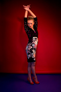
For my Debenhams photography project, I thought that a good way to enhance what I had done was to create a feature in a fashion magazine. From the images that I had, I found that they would work best in Elle magazine, as they are very similar to the type of think that they have done before and they fit well with the style of the magazine.
These are the original images that have to use:-
These are the original images that have to use:-
T-shirt Ideas


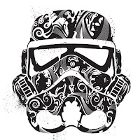
 I looked at a variety of different graphic ideas and t-shirt graphics to help me understand better the type of thing that I could put on a t-shirt, I found that a popular trend is graffiti style graphics and large logos/graphics across the front of the t-shirt. I liked the idea of creating a super hero style logo that represented the Respect brand, and also of creating my own graphic logo using a number of different shapes all put together in different ways, and at different angles. I also wanted to create a t-shirt that is bright and stands out, it doesn't necessarily have to be loaded with graphics, as the colours will make the t-shirt stand out enough on there own.

Subscribe to:
Comments (Atom)


